Friday, April 24, 2009

Authors where are you?

Alright. there are many points I could make about the experience I just had but this is the one (ok, maybe two) I'm choosing.

Amazon doesn't have pages for authors and this is confusing and problematic for people. The best evidence I can give you without doing some user research is found right on the site in plain view, so why haven't they fixed it?

This is what I discovered while trying to find a list of books by a particular author.

You can't click on an Authors name and get a list. Some of the big Authors names are hot and these took you to a search results list, not an Author page. This is kinda good but really actually bad because it breaks the pattern. If one Author name is hot, they should all be hot or you start to think you are going crazy.

I thought...this can't be right, maybe I'm missing something (please tell me if I am). So I search for Authors and look at the suggestions! I'm sure these are generated by the most commonly searched terms.
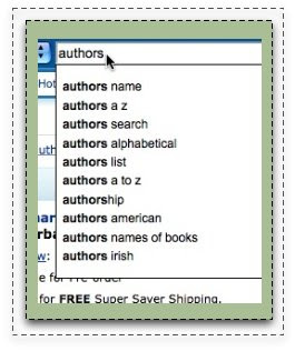

Seems other people are trying to find this illusive author page and list of authors

Now being in the web industry I can see a few reasons why they do this, but what seems so interesting is that they have diverted so far away from creating an experience that mirrors the physical world. Book stores are organized by author. I wonder what the larger impact of all this is?

Whatever the impact, it is lame and annoying. boo.

Concept Cheat Sheet

(as always, click to make bigger)

I want to share this very interesting deliverable that a designer I am working with produced. We are working on a redesign of the Big Brothers Big Sisters: Columbia Northwest site as a volunteer project through the AMA Community Outreach program (if you have skills you should check it out and do what Obama would do)

I had already done a very prescriptive wireframe when the designer joined our team and the next step we thought was needed as a mood board to get the visual design process going. In addition to the typlical mood board that experiments with type, color, imagery and tone he put together the above piece to demonstrate how the ideas in my wireframe had been realized on other sites. Kind of "concept cheat sheet."

Kinda cool. Still waiting to see how it actually works with client. I could see it being very useful or kinda confusing. But client aside it's an good communication tool for our internal team. Nice job Damon!

Have you done anything like this before?

Here's the original wire. If your into that kinda thing.

Wednesday, April 22, 2009

My life in tags

So this is me, or at least the topics that interests me. It's a tag cloud created from my delicious bookmarks. I feel a bit vulnerable putting this out here like this. don't judge me...that is unless you like what you see:)

You can make your own at Wordle. Thanks Wordle it's a lovely tool (i like tools, as you can see)

Guess what these words are.
You can browse the gallery and find out here.


found link from: Whitney

hey, when did delicious remove all the .'s?

Our Creative Personalities


This diagram and the associated definitions is wonderful. I think I'm going make a large print out and hang it at my desk.

What strikes me is how useful it could be in one, setting up a team, but two realizing who you are in a team make up so you can be the best you. I imagine we all have a bit of all of these, although I think as soon as you read the article you will immediately see yourself in one of them. I also think that the other people we work with will influence which of these actually manifest in us. If your naturally a dreamer and there are two other dreamers on the project, either the project is going to fail or someone is going to have to shift to one of the other types (at least try too)

The other thing I really like about this is that it provides a methodology for building good design teams, a methodology that isn't fixed on particular job titles but what you bring to the creative table. A well balanced multi-disciplinary team is beautiful thing but often, the confines of our particular roles and the lack of attention paid to the less concrete (our creative personalities) results in the assembly of a wobbly group of mismatched characters trying to work together.

Nice job Michael. I'm looking forward to reading the follow up posts about how each of these personalities work together.

So which one are you??

I like Candy.

I would encourage you to read this article over at A List Apart.
In Defense of Eye Candy by Stephen P. Anderson

He makes and illustrates a lot of great points about the role of beauty and attractiveness in the effectiveness of interfaces.

What I really like about the article is that is supports the need for "complete collaboration" between the UXer and the Graphic Designer. Neither one exclusively holds the power or skills to create the most successful experience. The work is so intricately joined. I'm starting to think you can't do your best work unless you are actually sitting next to eachother working each step of the way together.

I have a little dream of finding the perfect design partner, someone to develope the ultimate collaborative relationship with and create mind bending experiences together (maybe even take over the world). What if no one hired a single designer, you had to come with your design twin? Could be fun.

A few good passages from the article:

"As user experience professionals, we must consider every stimulus that might influence interactions"

"In other words, aesthetics is not just about the artistic merit of web buttons or other visual effects, but about how people respond to these elements. Our question becomes: how do aesthetic design choices influence understanding and emotions, and how do understanding and emotions influence behavior?"

"Basically, when we are relaxed, our brains are more flexible and more likely to find workarounds to difficult problems. In contrast, when we are frustrated and tense, our brains get a sort of tunnel vision where we only see the problem in front of us."

Head on over and have a read.

Thursday, April 16, 2009

Nagivation: Icons


i like icons in the navigation. i just do.


this is from Smile & Move.
you should watch the video. pretty neat and refreshing (thanks John)

Tuesday, April 14, 2009

Romantic Pagination

Is this not the most extremely romantic passage? It's Perfect. I came across this yesterday while browsing Scandal!in Bohemia. It's from a story published in the New Yorker and while I was there I of course forgot all about the romance and zeroed in on the pagination:)

It's really no frills in terms of visual design, you can't tell what is a link and it doesn't have a way to quickly jump to the first page, but what I do like is, "View as a Single Page". I like this for two reasons.

1. I would prefer to scroll, so it is lovely to have the option of doing that. It also feel particularly appropriate for this content, reading the New Yorker shares more in common with reading traditional print than say browsing camera reviews.

2. The word "Single". What a beautiful, simple, conversational, content appropriate way to to say "One Page". Just think about it. It feels romantic to me....

"The entire story fit on a single sheet of crisp white paper, which allowed me to fold it neatly and fit it squarely into the small pocket of my jeans, giving me a secret to carry around and produce throughout the day when every I needed a jolt."

Monday, April 13, 2009

Portland UX Book Club - Thursday!

Portland UX Book Club will have it's first gathering this Thursday. Woot! I'm feeling excited to get this thing started. It's been a few month since I decided to start the Portland chapter and it's been fun watching other clubs roll out across the world.

Our first book, Back of the Napkin by Dan Roam, isn't a UX specific book but a fun one that adds to the skills important for those of us out there practicing UX in all it's many forms. I'll be interested in hearing what parts of the book (method) are resonating and have practical application for other UX peeps.

If you are coming please RSVP or if you can't make it this time join the Google Group to stay informed.

Thursday, April 9, 2009

Natural mapping - Noah Iliinsky

I'd like to start sharing interesting articles and blog posts, but I don't necessarily need to comment on them except to say, "Nice thinking" So this is my new format. Click the image to read the full text.

Alternative to the traditional blah blah blah


Commenting.  


There is much to say about it but I'm only making one observation today. 


Commenting can be a great way to open up 2, 3 and 4 way communication between the content providers and the content receivers.  It can be a valuable tool for the creation of movements and the exchange of new ideas.   But we all know that that isn't always the case.  These days anyone can join the "conversation" and for many reasons this conversation can degraded.  


The quality of the comments not the quantity creates the value, that's why I like what CNN is doing.  Instead of open commenting on the articles,  they are aggregating instances that the article has been blogged about.  


What this does is create a barrier of entry to the conversation. You need to care enough to read the article, go to your blog, write about it and publish to your own community, in your own name. I imagine this raises the level of value in the "conversation" surrounding articles. Although it doesn't fill the same self-help function some other sites provide though*.  You think?


*no disrespect to the old HP. i'm a good Huffington Post loving liberal.

The economic collapse effects site messaging

Last year I worked on a career site for a big electronics company and as part of the work, I did some looking at other large company's career sites. I remember being struck by the Goldman Sachs site. It had an energy to it that was really engaging and seemed to say, "If you are young, super smart and wanna control the world, Goldman Sachs is for you."

I was wondering last night if the site had changed since the collapse of our financial market. Looks like it surely has.


Wish I had more screen shots from the previous version, but I think this one page comparison says a lot.

Goldman Sachs Careers

Wednesday, April 8, 2009

Can you create a hit experience?

what just happened when you saw this image?


here's what happened to me.

I noticed the colors and that it was kinda 60's. I liked the flowers...thought about blooming and blossoming

I thought about how my future seems bright..hey that was a realization, cool...I wonder who the artist is....I need to get back to painting...

then i heard the song. i don't really like the song but there was nothing i could to do keep it out, then i saw the "shades"...yucky I thought. My nice moment is over. I then continued humming the song in my head.


Couple things I'm thinking about.

1. I like that the image successfully took a very well know phrase and actually got me to respond to the original message not immediately jump to my old perspective and yes, dislike of the song and it's cliche message.

2. We all know the power of a song to evoke feelings and memories. What can I do to create experiences that are memorable and powerful. So much of my work is about the accomplishment of goals; users and business...tasks, processes, engagement...blah blah blah. If you've spent anytime with me recently you know I can't stop talking about how the true power in this world is held by those who sit in the Creative seat. Us Uxers can't forget that we sit in that seat and we should aim high with each project. It is possible to make an impact on someone that will haunt them for ever, like this dumb song.


image via: Design is Mine by Andy J Miller

Tuesday, April 7, 2009

Hey, nice form

Filling out forms has been part of life since......since.. maybe forever. Remember all the job applications you filled out trying to find your first job? That was lame.

So you can't really complain about online forms, for the most part they are basic, get the job done and aren't too frustrating (accept for incorrect tabbing order, choosing your country/state and hitting the cancel button instead of submit because it's located in the wrong place, or having to deal with endless error messages because required fields aren't indicated....ok. it's a little frustrating) but there are some gems out there.

Yesterday I filled out a form that was just peachy so I thought I would grab a couple screenshots and give some props.

Exhibit A: big fat fields with big fat fonts.

i can't get enough. when you get a form like this where the words dance across your screen happily with each entered letter you cam't help but feel like we have moved into the new generation of form filling. Aside from feeling good, being easy and looking nice, this type of form is great for grandpa and grandma.

-2 points: for cancel button being the same size as submit and so close to the next button.


Exhibit B:
You're doing good honey. Keep going. You're almost there.

Reinforcing good user behavior and confirming that things are moving along well is awesome. The motion of the check mark appearing on screen is like a big scratch and sniff sticker on your math homework.

Exhibit C:

There's no mistaking it....an Error has occurred.

I like this on two levels.

As a User it's clear, you can see that something happened and you don't have to find it amongst the graphic design. Yes, I know that you have to select OK and that this is another step, but you know, it's a trade off and I'm fine with it.

As a Designer, WHY don't I do this. Using system messages is easier and takes less design time. This will eliminate like 5 comps, because you always have to comp up the error message states.


So good job TheMoment. I'm looking forward to checking out your product...if you can get me to enjoy filling out your forms, I have high hopes:)

Monday, April 6, 2009

Can you make a website out of this room?

The late great home decorating magazine Domino had a series called, Can you Make this Outfit into a Room? (or something like that) It was great. I love seeing design inspiration flow between mediums. In the case of Fashion to Decor, I think the opportunity is to bring an intimacy to the room that you couldn't arrive at by beginning with the scale and function of a room. In fashion, texture (to the touch not just visual) and fit are major considerations. Applying these consideration particularly to a room adds a wonderful dimension. How does the pillow behind your back feel in combination with your bare feet on the flooring?

I came across this room today and immediatly thought it was great inspiration for web design. Don't you agreee? I am thinking about what is important when we design a room and what about that process to the interaction design table.

1. Sub Navigation and Supporting Content
2. Primary Navigation and Promotions
3. The company, here to help, ready to serve, happy that you are here
4. This is where you plug in. The opportunities. The two way conversation.
5. The trusted adviser. Why you come back again and again. The heart of the Brand.

*The Kitty = the hidden gems you find stuck in your mind long after you leave and that pop up again from time to time.


photo: via 7x7

Thursday, April 2, 2009

Taking UX to the floor

I was talking with a friend today and he made an interesting point. he thought that what we (ux professionals) are doing is innovation that hasn't really made it to the "brick and mortar" side of marketing. That in his world where they produce the experience you get in store or at special events hasn't even tapped the type of thinking and strategizing that we are doing in the digital realm. What do you think? I'm intrigued. I would love to be put on on one of his project and see what I could come up with. Just dive in and see what happens.

UX peeps are making leaps and bounds everyday in the quest to create relevant, meaningful experiences on the web and I know most of us spend time making sure the strategy extends beyond the web is some form (email, mobile, web acquisition), but what if the practice of UX went beyond the digital too. I know their are agencies who cross these boundaries, but the methods and practices of UX isn't even fully realized in most digital agencies so I can't imagine it's really made headway in this area. Have you done anything like this? Do share. I am interested in the process you use and the deliverables you make.

Wednesday, April 1, 2009

Surprise.


PostSecret is important because being creative requires allowing yourself to be honest with your thoughts. Reading these immediately puts me in a day dream wondering what truths I'm suppressing. When I find something, it's like a surprise party in my head and I feel a little amped-up on finding something I didn't know about myself. Channeling that energy towards a creative endeavor is perfect. Thank you @PostSecret

Post Secret is on tour. Check the site. You have to scroll down to find the schedule.

  © Blogger template 'Isolation' by Ourblogtemplates.com 2008

Back to TOP