We've moved
The UX Pillow blog has moved to it's new home.
http://www.tyeshasnow.com/
Come on over.

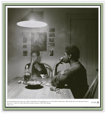
The Brooklyn Museum has jumped right into the "community pool" They're working with most of the tools available: collecting members for their "Posse", utilizing Flickr & Twitter, publishing member blog posts to the site, soliciting and posting member videos and what I'm looking at today, they have implemented a community tagging program on their site.
Art is the perfect candidate for this type of cataloging. Imagine all the many descriptive words you could come up with for this this photograph.
 What I think is really successful about this is the tone, it's positive and productive. It empowers the users without creating a climate of competition or negativity.
 Users also receive points for participating and are rewarded with special views of art not available to everyone else. I love these very appropriate awards, organization and companies should take a look at why their users are participating and find ways to strength this reason. In the case of the museum rewarding with more exposure to what the users love is brilliant. Although it may seem obvious many site might have given a t-shirt or points towards partner products instead of what the users really want.

There is a nice article over at Scientific America about how humans interact with and react to the build environment. I thought it was a nice reminder of for those of us who spend our days designing digital environments that what we create, though not wood and drywall are spaces that people spend time in but what I found really interesting was on of the experiments they discus.
" In 2007 Joan Meyers-Levy, a professor of marketing at the University of Minnesota, reported that the height of a room’s ceiling affects how people think. She randomly assigned 100 people to a room with either an eight- or 10-foot ceiling and asked participants to group sports from a 10-item list into categories of their own choice. The people who completed the task in the room with taller ceilings came up with more abstract categories, such as “challenging” sports or sports they would like to play, than did those in rooms with shorter ceilings, who offered more concrete groupings, such as the number of participants on a team. Because her earlier work had indicated that elevated ceilings make people feel physically less constrained, the investigator posits that higher ceilings encourage people to think more freely, which may lead them to make more abstract connections. The sense of confinement prompted by low ceilings, on the other hand, may inspire a more detailed, statistical outlook—which might be preferable under some circumstances"
Wow. I'm pretty cognizant of the impact of environment on how you feel and your ability to think. Personally I'm extremely effected by it, I've even had to leave a couple jobs due to the environment. Reading this article has me thinking about the research I have conducted and how I will conduct it in the future. I also love that they use a card sort! (great validation for the method).
It's a big week in Ptown for techy/designy types. In addition to these formal events, I hope and assume there will be plenty of impromptu meet-ups in bars around town. If you know of other things let me know! See you all there. Tweet me if something fun happens and you don't see me there:
Wednesday-Friday 20-22
 WebVisions
 WTF is Social Media

I just submitted a proposal for Ignite Portland. The topic is about applying what I've learned working with essential oils to design and the creative process. Sound interesting? I think so. Now I just have to flush it out.
If I get in this will be my first presentation outside of work since high school. Kinda crazy. Hope I can do it:)
You can check out the full list of proposals here. If you participate in the voting (which you can) I hope you will vote for me and John from MilkMuny (because his presentation will be truly inspiring)
Ok, sorry for the slowed posting lately, I have a bunch of balls in the air right now, but they are all providing me with good writing ideas (if I can get around to it!)

Ever since I was a kid I've spent a lot of time looking at the ground directly outside of the car as it speeds down the road. I like to notice the different types of dirt and dust and the particular way it drafts up to the curb, edge of the grass or the highway median. There are always little bits of metal, sometimes trash. Little plants grow, bugs crawl around, it's about what you would imagine.
What I've always thought to myself when looking at these particular moments in time and place is how completely unique each spot is. I could never recreate it and I will never see it again, but all of these little views add up to a larger sense of what happens in a particular place. Not sure what I learn from it, maybe nothing but I believe in NOTICING THINGS.
The people I know who have great ideas and amazing creative vision are all NOTICERS. They look for the OUT-OF-FOCUS THINGS and make LESS THAN OBVIOUS CONNECTIONS. They allow the unimportant to seep into their daily narrative.
I've learned that spending time contemplating things you already understand or expect, does nothing to stretch an exercise your mind. To be a true creative thinker you have to take the many opportunities available to NOTICE SOMETHING NEW.....you have to develope an original perspective from these opportunities.
Yossi Milo has a series of photographs that embody this concept of noticing.
These are all stolen moments from driving down the highway. Brilliant.


I found this artist via: NOTCOT
We are all trying to create something that will be used and the path to this sucess is designing for a particular group of people.
It isn't just about solving a particular PROBLEM or coming up with a particular IDEA.
Only when you match a PROBLEM with a PERSON or an IDEA with a PERSON are you at the place where you can start making design decisions.
There's always more than one way to do something and what validates one choice over the other is if it's the best choice for someone specific (this often means a group of someones)
This example is super simple (maybe too simple) but it expressed my point. This site has a main navigation just like most sites because like most sites it needs to solve the problem of getting peeps to some major chunks of content so they may interact with it. They also have an idea (to share information about the company)....
but where is the Navigation? If this was a store or a bank site we would have a problem. But it isn't a store or bank. It's a creative company that is hoping to attract companies who are ready to engage the creative process to improve their businesses.
These people don't have the same needs. There is no need for a persistent, in your face navigation. They will enjoy the page and then when ready roll over the little box, expose the navigation and choose another topic to explore. They are willing to discover and uncover (woo, i like that)
 I'm just a fan of the O.W.N (only when necessary) approach to design (yes, I just made that up) Not everything needs to be shoved in our faces, and for some PROBLEM + PERSON combinations, the more standard, blatant approach is the wrong one.
 3. The Topics pages are a great idea. Hope it works out.
 Alright. there are many points I could make about the experience I just had but this is the one (ok, maybe two) I'm choosing.
Amazon doesn't have pages for authors and this is confusing and problematic for people. The best evidence I can give you without doing some user research is found right on the site in plain view, so why haven't they fixed it?
This is what I discovered while trying to find a list of books by a particular author.
You can't click on an Authors name and get a list. Some of the big Authors names are hot and these took you to a search results list, not an Author page. This is kinda good but really actually bad because it breaks the pattern. If one Author name is hot, they should all be hot or you start to think you are going crazy.
I thought...this can't be right, maybe I'm missing something (please tell me if I am). So I search for Authors and look at the suggestions! I'm sure these are generated by the most commonly searched terms.
 Seems other people are trying to find this illusive author page and list of authors
Now being in the web industry I can see a few reasons why they do this, but what seems so interesting is that they have diverted so far away from creating an experience that mirrors the physical world. Book stores are organized by author. I wonder what the larger impact of all this is?
Whatever the impact, it is lame and annoying. boo.
 (as always, click to make bigger)
 So this is me, or at least the topics that interests me. It's a tag cloud created from my delicious bookmarks. I feel a bit vulnerable putting this out here like this. don't judge me...that is unless you like what you see:)
You can make your own at Wordle. Thanks Wordle it's a lovely tool (i like tools, as you can see)
 I would encourage you to read this article over at A List Apart.
In Defense of Eye Candy by Stephen P. Anderson
He makes and illustrates a lot of great points about the role of beauty and attractiveness in the effectiveness of interfaces.
What I really like about the article is that is supports the need for "complete collaboration" between the UXer and the Graphic Designer. Neither one exclusively holds the power or skills to create the most successful experience. The work is so intricately joined. I'm starting to think you can't do your best work unless you are actually sitting next to eachother working each step of the way together.
I have a little dream of finding the perfect design partner, someone to develope the ultimate collaborative relationship with and create mind bending experiences together (maybe even take over the world). What if no one hired a single designer, you had to come with your design twin? Could be fun.
A few good passages from the article:
"As user experience professionals, we must consider every stimulus that might influence interactions"
"In other words, aesthetics is not just about the artistic merit of web buttons or other visual effects, but about how people respond to these elements. Our question becomes: how do aesthetic design choices influence understanding and emotions, and how do understanding and emotions influence behavior?"
"Basically, when we are relaxed, our brains are more flexible and more likely to find workarounds to difficult problems. In contrast, when we are frustrated and tense, our brains get a sort of tunnel vision where we only see the problem in front of us."
Head on over and have a read.


© Blogger template 'Isolation' by Ourblogtemplates.com 2008
Back to TOP